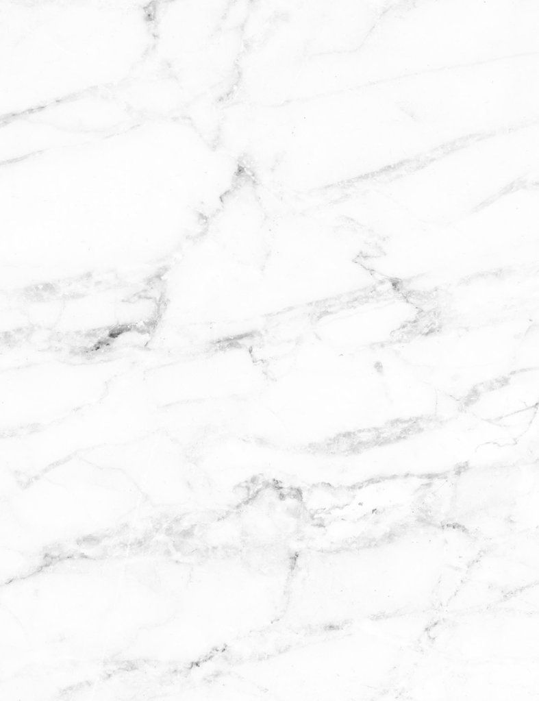
ANNITA APOSTOLIDOU PLATIS
**EMERALD ARTIST OF THE YEAR 2025**
Annita Apostolidou Platis was named the RUBY ARTIST OF AUGUST and the CRYSTAL ARTIST OF DECEMBER and was therefore granted entry into the 5th Annual ARTISTS OF THE YEAR EVENT — which led to her ultimate capture of the sparkling
EMERALD ARTIST OF THE YEAR 2025 title.
You are invited to enter this masterful artist’s evocative and sublime paracosm — it comprises atmospheric and immersive pictures with attached ethereal and exquisite statements which deepen appreciation and elevate and expand the visceral experience.
Discover work from her series When Color Knows The Script — read about its elusive conceptual basis and her fascinating and original way of sensing, accepting and presenting colour. Get a glimpse of her recently published artist monograph, learn about the extensive research, careful preparation and complex process involved in the series and be impressed by the beautiful vision and intention behind the graceful, feminine presence which dominates her irresistible and transcendent dreamscape.
Find it all right here in the following feature and interview which was created in recognition and celebration of her EMERALD ARTIST OF THE YEAR 2025 title.
"My work is a visual language shaped by colour, symbolism and quiet emotion. I create portraits and narrative images that exist between the seen and the felt—where memory, mythology and identity surface without explanation. Creating art is my way of breathing, listening and translating what cannot be said. Each work invites a slower gaze and an inward pause — where colour speaks first and meaning quietly unfolds.”
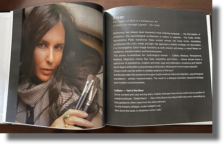
Annita Apostolidou Platis is a multidisciplinary visual artist, curator, essayist and poet based in Athens, Greece. Known for her luminous chromatic language and symbolic depth, her work explores mythology, transformation, memory and feminine identity through both traditional and digital forms.
She began painting at the age of eight under the mentorship of academic painter Dimitris Kantopoulos. She later studied at the Istituto Artistico dell’Abbigliamento Marangoni in Milan, earning an Advanced Diploma in Fashion, a Master’s in Jewelry Design & Accessories and completing advanced studies in Interior Design.
In 2016, she returned fully to painting, creating a series acquired in its entirety by a private Italian collector and permanently displayed in boutique villas in Portofino. Since then, her work has been exhibited internationally across Europe, the United States and Australia and has been recognized through numerous international juried exhibitions and awards.
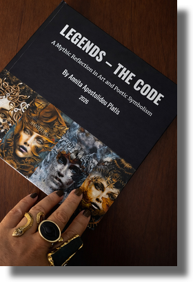
Her distinctions include the Fondazione Costanza International Career Award, the Hermes and Poseidone awards from Accademia Italia In Arte Nel Mondo and the Award of Merit for Cultural Contribution from the National Olympic Academy of Greece (HOA). In 2024, she received certification in Art Curation & Exhibition Management from the Visual Artists Association. Alongside her artistic work, she engages with cultural dialogue, advocacy and global platforms supporting women in the arts. Her recent artist publication Legends – The Code further expands this dialogue through a combination of visual works and reflective texts exploring mythology and feminine identity.
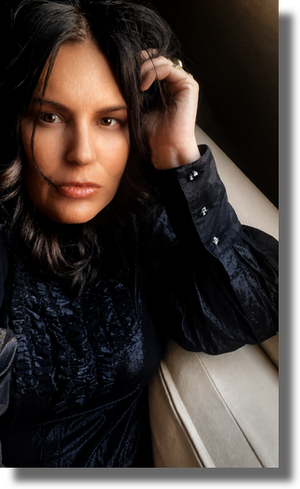
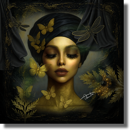
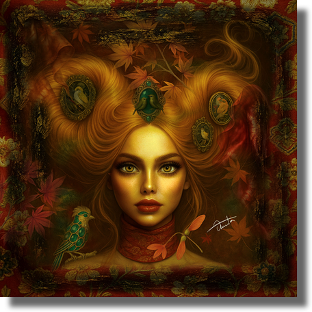
* Sylva *
From the series When Color Knows The Script
Mixed media digital collage
“In Sylva, green assumes authorship. It does not merely describe nature; it directs it. The hue becomes a sovereign presence, shaping the emotional architecture of the portrait before form fully resolves.
The figure emerges from an interior landscape, where a bonsai rises like a cultivated crown and chrysanthemums, lime roses, ivy and zinnias gather into a living mantle. Vintage brooches bearing the snake and beetle appear as emblems of instinct, renewal and transformation. The wings suggest vigilance and ascent yet remain rooted in foliage. This work is drawn to the space where identity dissolves into atmosphere, where the seen and the felt converge. Rather than illustrating a forest, Sylva constructs one psychologically: an inner grove where growth, myth and restraint coexist. Here, green leads the narrative. The figure does not wear the color; she is written by it.”
GR — Welcome Annita Apostolidou Platis! (What a name!) Congratulations on winning EMERALD ARTIST OF THE YEAR 2025. At what point in your art practice does this title meet you and how does it find you? How do you think it will participate?
AAP — This title meets me at a moment of expansion and quiet consolidation in my practice. I find myself working across parallel series, each with its own emotional and symbolic language, while also having recently completed a monographic publication that brings together image, text and reflection. At the same time, my engagement with curatorial writing continues to deepen the way I articulate and examine visual thought. Recognition, in this sense, does not stand apart from the work, it enters it. It becomes a point of reflection but also a form of responsibility. It asks for greater clarity, greater honesty and a continued commitment to the language I am shaping. I see this title not as a conclusion but as a companion moving forward, one that quietly participates by reinforcing the need to remain attentive, disciplined and open. It carries with it not only a personal significance but also an awareness of those who engage with and believe in the work and the shared space that art creates between artist and viewer.
* Between Yes And No *
From the series When Color Knows The Script
Mixed media digital collage
“Between Yes and No captures the tension of thresholds — emotional, perceptual and symbolic. In this surreal composition, the concepts of openness and closure are not opposites but intertwined conditions. The figure floats in a space that resists binary definitions, framed by symbols of duality: doors half-opened, gestures half-formed, truths half-told. Here, colour doesn’t resolve conflict, it reflects it. The palette moves between contrast and harmony, revealing that the real theatre of decision is not in the act but in the pause before it. It is the moment between inhale and exhale, between thought and voice, between “yes” and “no”
— and in that liminal pause, something essential lives.”
GR — Mixed Media Digital Collage is how you list the medium of your work but it can be misleading as this designation is restrictive and imprecise — it does not capture the full range and reality of your talent and process. What makes you extend and change your traditional, handmade drawings and designs into digital material?
AAP — The term “mixed media digital collage” is, in many ways, only a surface description. What draws me to this process is not the medium itself but the possibility of transformation it allows. Everything begins by hand, through drawing, in a direct and personal way. These initial forms carry immediacy, a direct connection to thought and instinct. The digital space then becomes a place of reconstruction, where fragments are reassembled, recontextualized and allowed to evolve beyond their original state. It is not a departure from the handmade but an extension of it. I am interested in the dialogue between control and surrender, between what is intentionally placed and what emerges through layering and association. The digital medium offers a kind of fluidity where time, memory and symbolism can coexist more freely, without the constraints of a single physical surface. In some cases, the work returns to the material world, translated onto canvas and further developed through paint, adding texture and presence. In others, it remains within its digital form, complete in its own language. For me, technology is not a replacement but a tool of expansion. It allows me to move between states, drawing, constructing, dissolving, rebuilding, until the image reaches a point where it feels internally resolved. What matters in the end is not the medium but whether the work carries emotional resonance and a sense of inner necessity.
GR — Can you discuss the meaning of your series When Color Knows The Script? What are you trying to discover, honour or communicate? What ignited this idea and what kind of research or preparation was involved? How many pieces are in this series and is it complete?
AAP — When Color Knows the Script emerged from a need to understand how emotion forms before language, how something is already known and felt long before it can be articulated. I became interested in the idea that colour itself could carry that pre-verbal awareness, not as decoration but as a leading force within the image. In this series, colour is not applied after the fact; it initiates the work. It carries emotional and symbolic weight, often preceding form, almost as if the image begins as a feeling rather than a structure. Colour becomes a way of thinking, of sensing before it becomes something to be seen. The figures and objects that appear within the works, umbrellas, vessels, birds, fragments of domestic or symbolic space, are not constructed as narratives in a linear sense. They function more as emotional markers or points of recognition. I am interested in creating a space where the viewer does not simply observe but begins to feel connections, sometimes even recognizing something personal, something lived without immediately knowing why. The series is deeply rooted in introspection. It evolves through reading, observation and long periods of internal processing but equally through drawing and visual experimentation. It's a slow process because each work needs to reach a certain internal coherence before it becomes part of the whole. At this stage, the series consists of 18 works and continues to grow. I don't approach it with a fixed endpoint. It unfolds as long as the questions within it remain active, around identity, perception and the quiet language of colour as a carrier of meaning.
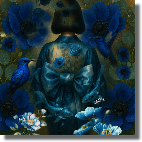
* Aokage *
From the series When Color Knows The Script
Mixed media digital collage
“Aokage captures the quiet presence of solitude. Cloaked in layered shades of blue, the woman becomes a silhouette of memory — anonymous, yet deeply known. Around her, koi and hummingbirds move like whispered thoughts, while anemones bloom as fragments of emotion. In stillness, she becomes the shadow of something eternal — soft, unseen yet profoundly felt.”
GR — You have a remarkable capacity for eloquence and skill with words — symbolic and graceful descriptions which accompany your work drift, float and glide around your images as if caressing them from all sides. The audience just cruises and coasts along in a combined art and poetry ride. Your biography states that you are an essayist and poet. Can you talk about this writing experience and how it supports your art practice? Do you consider the words extrinsic — a sort of external accessory — or are they integral and even one with the image? Is it your wish to always present words and images together?
AAP — Writing, for me, is not an addition to the work — it is part of the same language. It moves alongside the image, sometimes preceding it, sometimes following but always belonging to the same internal process. There are moments when a text comes first, a phrase, a rhythm, a thought that needs to take form and it later becomes an image. At other times, the visual emerges first and writing allows me to move further into it, to unfold layers that remain unspoken within the image itself. It is a continuous dialogue between the seen and the articulated. I do not feel the need to always present words and images together but I recognize that writing allows me to extend the experience, to offer what we might call “food for thought” — a space where viewers can pause, reflect and perhaps reconnect with something within themselves. In a world that moves quickly and often superficially, I am interested in slowing that movement down and creating moments of inward attention.
My relationship with writing began early. Even before fully committing to visual art, I was drawn to language as a way of observation and expression. Over time, it became clear that both practices, visual and textual, share the same origin. They are different manifestations of the same need: to translate what is felt but not easily said. The voices of poets such as Pablo Neruda and Fernando Pessoa have been important to me from a young age, shaping my sensitivity to language and to the expression of inner states. At the same time, authors like Isabel Allende and Agatha Christie have influenced me in different ways — through narrative structure, atmosphere and the subtle unfolding of meaning. This dialogue between poetic intuition and narrative construction continues to inform the way I write. Alongside my artistic practice, writing also takes form through essays, articles and curatorial texts developed in collaboration with galleries and art foundations. In these contexts, language becomes a space of reflection and articulation, allowing me to engage more consciously with visual culture and symbolism. Ultimately, whether through image or through text, I seek to create a space where meaning is not imposed but discovered, where the work remains open enough for viewers or readers to enter and complete it in their own ways.
* She Who Carries The Invisible *
From the series When Color Knows The Script
Mixed media digital collage
“She Who Carries the Invisible is a portrait of presence without display, of truth held quietly beneath the surface. The central figure bears her symbols with silent authority. Objects that don’t declare but suggest; gestures that don’t explain but contain. There is no spectacle here. Only a woman cloaked in her own knowing, radiating the weight of unseen stories. The composition is vertical, like a shrine - framing her not as muse but as vessel. The interplay of deep green, matte black and muted gold suggests an interior world where memory shimmers quietly and transformation unfolds in stillness. Light touches her like a secret.
In this work, visibility is not the goal — integrity is.”
GR — She Who Carries The Invisible is best described as divine — an offering to the gods. The image is so powerful yet delicate, gentle and silent — this is prayer made visual and material — you make contact here. Your description — including the amazing title — equals the ethereal beauty of the picture. How do you manage to make such a subtle and elusive idea into tangible art and poetry for everyone? Which came first — the image or the words? Can you talk about this stunning work?
AAP — She Who Carries the Invisible is, for me, a meditation on inner presence, on what is held rather than what is revealed. The figure does not perform or explain; she contains. What interested me was the idea of a quiet, almost sacred form of strength, one that does not need visibility in order to exist. The work developed as an atmosphere before it became an image. There was a sense of stillness, of verticality, almost like a shrine, where the figure is not an object of gaze but a vessel, holding memory, transformation and an interior kind of authority. The palette reinforces this inward movement, where light does not fully illuminate but touches selectively, as if passing through something intimate and protected.
The symbolic elements are present but not intended to be decoded in a fixed way. I am less interested in assigning meaning than in creating a space where meaning can be felt. What appears subtle or elusive is allowed to remain so. I believe that connection often happens in that space of partial recognition, where viewers meet the work with their own inner experiences. In this case, the image came first. It emerged with a certain clarity of feeling — almost complete before it was constructed. The writing followed — not as explanation but as a continuation of that same internal listening. For me, language does not define the image; it enters it. If the work feels like an offering, it is because it was approached with that intention — not to present something outwardly but to hold a space — a space where the invisible is not exposed but honoured.
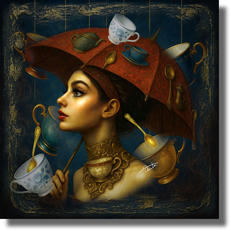
* The Sweetness Of Control *
From the series When Color Knows The Script
Mixed media digital collage
“In The Sweetness of Control, elegance becomes architecture and nostalgia transforms into a quietly commanding presence. Balancing a richly embroidered umbrella adorned with vintage teacups, teapots and golden spoons, the central figure embodies restraint veiled in ritual. Porcelain and gold float around her like delicate weapons of etiquette — chosen, placed and never accidental. Each object is both ornament and intention, transforming a moment of tea into a stage of subtle dominance. In this piece, the refined palette of vintage reds, warm golds and porcelain blues evokes the ritualized grace of tradition, where gentleness disguises precision and restraint. There is no sugar here, only the suggestion of sweetness. Tea time, in this surreal domestic theatre, becomes less about indulgence and more about design: of gesture, grace and hidden power. To serve is not to surrender, it is to orchestrate.”
GR — A variety of elements float, hover and rest quietly and innocently enough in your pictures yet their presence is powerful, mysterious and alluring. Those from the natural world are soft, gentle and easily accepted but numerous man-made objects made of hard and heavy materials are more surprising. These beautiful antique and vintage pieces suggest a turn back in time. What is your intention behind these intriguing items — what are you symbolizing, declaring or exploring?
AAP — The distinction between natural and constructed elements in my work is intentional and it reflects a deeper psychological structure within the image. Natural forms, flowers, birds, water are received almost intuitively. They belong to a shared visual language that feels immediate and emotionally accessible. They enter the composition as extensions of the inner world: intuition, memory, fragility and flow. In contrast, man-made objects introduce a different kind of presence. Keys, cages, porcelain and utensils carry not only material weight but also the imprint of human experience. They are tied to systems of ritual, control, habit and social codes. Their presence within a dreamlike or poetic space creates a subtle tension, precisely because they belong to structure rather than instinct. This contrast is central to my work. I am interested in the dialogue between what is innate and what is constructed, between emotional truth and the frameworks we inherit or impose. The fact that many of these objects are antique or vintage is also significant. It introduces time as a living layer within the image. These are not neutral forms; they carry traces of use, memory and repetition. They suggest lives already lived, gestures already performed, meanings already shaped before entering the composition.
My background in fashion, jewelry and interior design has influenced this way of seeing. I perceive objects not as decoration but as intentional forms — precise, symbolic and narratively charged. Each element is placed not to embellish but to contribute to a larger internal logic. For this reason, the compositions function less as scenes and more as environments — spaces where natural and constructed elements coexist, interact and sometimes quietly resist one another. Meaning does not arrive as a fixed statement but emerges through this interplay, shaped by contrast, memory and tension.
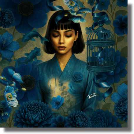
* Aiyume *
From the series When Color Knows The Script
Mixed media digital collage
“Aiyume unfolds in a realm between waking and sleep. The woman, wrapped in oceanic blue, drifts through a dream where koi swim freely and a birdcage hangs open, symbols of spirit and surrender. Anemones surround her like forgotten wishes, suspended in time. This is a portrait of inner hypnosis,
where blue is not just seen but deeply felt.”
GR — A young woman — delicate and elegant in manner and carriage — is the centre of each piece in this series. This portrayal returns to the traditional representation of women enhanced by the many vintage items around her. Is this a deliberate and possibly challenging statement — to be feminine in demeanor is not mutually exclusive to female strength, independence and empowerment? Who is she to you? What does she carry or stand for?
AAP — The presence of the female figure in my work is intentional but not conceived as a statement in opposition. It is closer to a recognition — an understanding that femininity contains a wide spectrum of strength that does not always need to present itself through force or assertion. The women in these works are not defined by fragility even when they appear delicate. Their stillness, their composure their refinement — these are not signs of passivity but of a held presence. There is an inner structure — a form of awareness that does not need to be declared in order to exist. The dialogue with vintage elements reinforces this idea. These objects carry traces of time, memory and continuity. Rather than referring to restriction, they allow me to place the figure within a longer lineage — one where elegance, discipline and resilience coexist. The past is not something to return to but something that continues to resonate within the present, as if time itself exists not as sequence but as a continuous, unfolding now. To me, the feminine figure is not a fixed identity but a vessel. She carries perception, memory, contradiction and quiet transformation. She does not resolve or explain; she holds. What she represents is not a single idea of strength but a more nuanced one, where sensitivity, restraint and presence become forms of power.
GR — You have a professional background in artistic fields such as fashion, jewellery and interior design. Can you talk about your influences and in what way they contribute to your art today? Was it a natural and easy shift to visual art and is it your main focus now?
AAP — My background in fashion, jewelry and interior design has shaped the way I perceive and construct images but I do not experience these disciplines as separate paths. They form a continuous foundation that informs my visual language. Fashion introduced me to structure, movement and the relationship between form and the human presence. Jewelry refined my attention to detail, precision and the way light interacts with materials. Interior design expanded my understanding of space, balance and composition and how elements coexist within a constructed environment. These disciplines trained my eye to think in terms of harmony, tension and material sensitivity, which continue to guide my work today. The transition into visual art was not a rupture but a return. Drawing had always been my starting point and at a certain moment it became clear that I needed a space where all these influences could converge more freely, without the functional constraints of design. In that sense, it felt natural, almost inevitable.
My influences extend across different movements and forms. I have been deeply drawn to the elegance and ornamental richness of Art Nouveau and Art Deco, the symbolic and psychological dimensions of Surrealism and the clarity and restraint found in Japanese aesthetics. Artists such as Klimt, Mucha, Dalí and Hokusai have shaped my sensitivity to composition, symbolism and visual narrative. At the same time, literature has played an equally important role. Writers and poets like Pablo Neruda, Fernando Pessoa, Isabel Allende and Agatha Christie have influenced the way I think about atmosphere, structure and the unfolding of meaning, whether through emotion, introspection or narrative construction. Today, visual art is my primary focus as it allows me to bring all these elements together — image, symbolism, material and language — within a unified practice. At the same time, I do not see creativity as something that moves in a single direction. I remain open to returning to design in different forms, when it aligns with the evolution of my work. For me, art is not linear; it is a continuous, expanding field.
* A Song In The Red Branches *
From the series When Color Knows The Script
Mixed media digital collage
“A Song in the Red Branches is a portrait woven from nature, longing and quiet transformation. The Japanese momiji tree — its red branches ablaze with memory — frames a world where time lingers and emotion is carried in colour. Among the crimson leaves, bush warblers perch like brushes in mid-stroke, delicate and intentional. These birds are rarely seen yet their call is unmistakable. So too is the figure, serene, composed yet filled with an unspoken inner music. She does not speak; she listens to what only the wind through red leaves can carry. Warm coppers, mossy greens and antique reds echo the timbre of memory — each hue a note in the song of nostalgia, lineage and fragile grace. This is not just a dream.
It is a remembrance in seasonal disguise.”
GR — A Song In The Red Branches is breathtaking — that central figure as perfect as a doll with that gaze and that dreamy hair decked out with those exquisite brooches and that bird on the shoulder — time for a collective deep sigh from all viewers. Memory and the passing of time are themes that seem to come around often in your work — does this reflect something personal you are contemplating? What made this showstopping piece come to be? Can you talk about your choice of warblers and the momiji tree as motifs?
AAP — A Song in the Red Branches is closely connected to my relationship with memory and the quiet passage of time. These are not themes I approach as something distant or abstract; they are part of an ongoing inner reflection. I am drawn to moments that feel suspended, where something is both present and already fading, where emotion exists without needing to be fully spoken. The work emerged from that kind of atmosphere. Not as a constructed idea but as a feeling that gradually took form through color, through stillness, through the presence of the figure. There is a sense of listening within the piece, as if something is being received rather than expressed outwardly. My connection to Japanese culture has been present since childhood. I was deeply influenced by its stories, imagery and philosophy and by the way it approaches beauty through transience, subtlety and restraint. These ideas have stayed with me over time and naturally enter my work, not as references but as a sensibility.
The momiji tree, with its shifting red leaves, carries for me a sense of fleeting beauty, something intense and luminous that exists only for a moment before it transforms. It reflects that quiet awareness of impermanence that runs through much of my work.
The bush warblers function differently. They are rarely seen yet deeply felt through their presence and sound. In the work, they are reimagined as ornamental forms, almost like vintage brooches or delicate jewelry pieces that rest upon the figure, merging nature with artifice. I was drawn to this duality, the visible and the invisible, the organic and the constructed, the silent and the resonant. In the same way, the figure does not declare; she listens. There is an inner music within the work that is not performed but held. This piece came together as a kind of emotional landscape, where memory, nature and perception intertwine. It is less about telling a story and more about creating a space where something can be sensed — something that feels both personal and quietly universal.
GR — Your work has many intricate details such as jewelry and vintage spoons and dishes with lots of scroll designs and floral patterns. Do you draw and design these yourself? Do you use a live model, photo reference or your imagination when creating the figures? Can you walk through your technical process from beginning to completion?
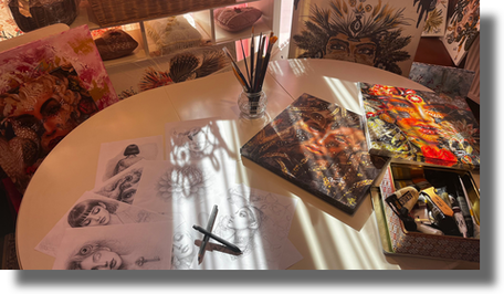
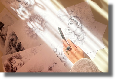
AAP — My process begins with observation and research. I am often drawn to vintage objects, historical references and visual material found in books, archives and magazines. These sources provide not only forms but also a sense of time, memory and cultural resonance. I may also work with collected visual references, including archival material or found imagery, which I transform and reinterpret through digital processes, integrating them into the composition until they become part of a unified and original visual language. From there, I move into drawing. I sketch and design the elements by hand, using pencil or charcoal, developing both the figure and the symbolic components that will later become part of the composition. Drawing remains the foundation of my work; it allows me to establish structure, gesture and intention before the image evolves further. The next stage is digital reconstruction. Here, the work is not assembled mechanically but carefully composed. The elements are integrated into a unified visual language, often embedded as ornaments or symbolic objects that interact with the figure. I am interested in how these forms coexist, how they create meaning through placement, balance and subtle tension.
Technology, for me, is not a replacement for traditional practice but an extension of it. It offers a certain freedom to construct, deconstruct and refine the image until it reaches a point of internal coherence. In some cases, the process returns again to the material world. I print the work on canvas and re-enter it physically, adding delicate interventions with metallic pens or fine brushwork. This stage introduces texture and tactility, almost like embroidery, bringing the image closer to an object that carries both visual and material presence. This sensibility is closely connected to my background in fashion and design. I do not follow a rigid system but there is a consistent structure underlying the process: drawing, construction and refinement. Each work develops differently, depending on the idea and the emotional atmosphere I am trying to achieve. What remains constant is the intention to create an image that functions not only visually but symbolically —that can be read, felt and interpreted in many ways.
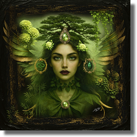
GR — Congratulations on the recent publication of your book Legends — The Code! This is an impressive achievement and a perfect vehicle to display your visual art and writing together. Can you describe this project — the dream and purpose behind it — the effort — the outcome — the satisfaction of holding it in hand?
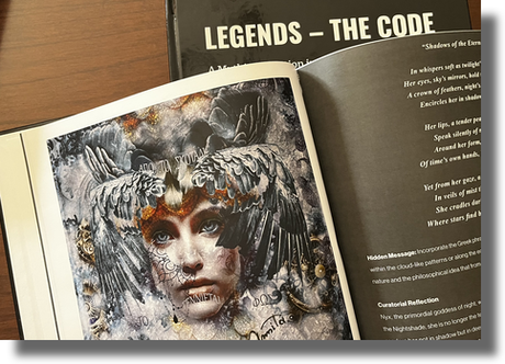
AAP — Legends – The Code began as a body of work — an exploration of mythological female figures whose presence continues to resonate across time. The initial body of work brought together ten mixed media digital collages, each centered on women whose stories carry strength, resilience and transformation. These figures are not approached as distant myths but as living archetypes. The project evolved naturally from my earlier series Links, where I explored connections between women, nature, mythology and history. Links became a conceptual bridge, leading into the development of Legends – The Code where I felt the need to go deeper, not only to create images but to enter into a more reflective dialogue with these narratives. Alongside the development of the series, I expanded this exploration through writing. As part of my ongoing collaboration with the Barbagelata Foundation, I contributed an essay examining the enduring presence of mythological female figures across time. This parallel engagement allowed me to approach the work not only visually but also critically, deepening its conceptual foundation. The book later emerged as a natural continuation of this process. Developed in collaboration with Sfumato Art Creatives and published as a hardcover artist book, it brings together the complete series alongside curatorial texts, poetic reflections and symbolic interpretations. It was important for me that the book would not function simply as documentation but as a space where image and language coexist and expand one another.
The process itself was layered and immersive. It involved research, reading, writing and continuous visual refinement. Each artwork — paired with text — became part of a larger narrative structure — one that reconsiders mythology not as something fixed in the past but as a living language that continues to evolve. Holding the book in my hands was a very particular experience. It is one thing to create individual works and another to see them gathered into a cohesive, tangible form. There is a sense of completion but also of transition, as if the work has moved into another state of presence. Ultimately, Legends – The Code is about translation — the act of reinterpreting myth into a contemporary visual and textual language and opening a space where these narratives can be re-examined, felt and reimagined today. More information can be found here.
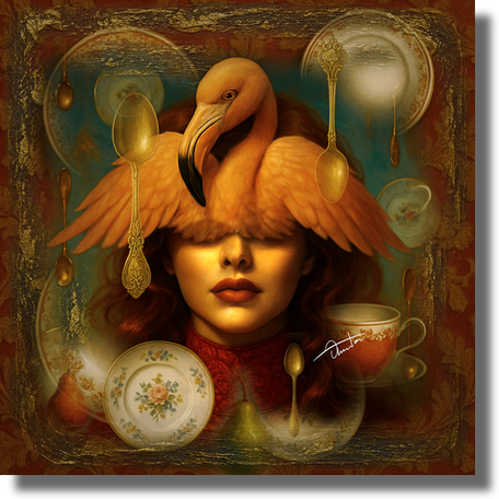
* What Falls In Velvet Silence *
From the series When Color Knows The Script
Mixed media digital collage
“What Falls in Velvet Silence is a still-life of emotion dressed as a dream. Golden spoons and vintage porcelain frame a ritual of softness, where sweetness is measured, fruit descends mid-air and a flamingo closes her eyes as if memory itself is too tender to witness. The pears fall slowly, not with drama but with surrender. The flamingo, elegant and surreal, presides like a silent hostess of fantasy. The setting suggests a domestic altar, where every object holds quiet meaning and every gesture is both a memory and a metaphor. Burnished oranges, vintage golds and soft crimson hues wrap the scene in quiet opulence where sweetness, fragility and the absurd converge beneath theatrical stillness. Here, nothing crashes.
Everything lands gently — in velvet silence.”
GR — Why does working in series appeal to you? Is the number of pieces in a series a limit you set for yourself? Can you talk about the preparation involved? What is next for you — a new series or another book? Anything you wish to share?
AAP — Working in series is essential to my practice because it allows me to enter a subject more deeply, beyond a single image. A series creates a space where ideas can unfold gradually, where symbols, figures and colours begin to form their own internal language. Each work becomes part of a larger structure and meaning develops through continuity rather than isolation.
I do not approach a series with a fixed number of works. The scale is determined by the needs of the idea itself. Some series reach a natural point of completion earlier, while others continue to expand over time. I do not think in terms of quantity but in terms of coherence. I follow an internal sense of when a body of work has reached its full expression though I remain open to returning to it if something new emerges. The preparation is both structured and intuitive but it is always rooted in an internal state. Emotion plays a central role in the development of a series. It often begins with research, reading and observation but equally with feelings that surface and seek form. Inspiration may emerge through experience, travel, music or cinema yet it is ultimately filtered through something personal. Drawing allows me to shape this inner material into a visual language while writing helps me articulate and deepen its meaning as the series evolves.
At present, I am working on a new series that is still in progress, still evolving through research and experimentation. Alongside this, I continue my writing practice, contributing essays and articles in collaboration with art foundations and galleries, which allows me to engage with visual culture from a different perspective. I am also expanding my involvement in the curatorial field. I will be joining the juror panel of CEV Art Gallery, contributing to the evaluation and selection of international exhibitions. This role allows me to approach artworks not only as an artist but also through a curatorial lens, considering their conceptual depth, structure and emotional resonance. I believe that when working as a juror it is essential to step beyond one’s own artistic perspective and approach each work with objectivity, clarity and respect for its individual intent. At this stage, I am not actively planning a new book, as I consider the creation of a monograph to require time, depth and the right moment to emerge. For me, each new project requires time, attention and a certain level of maturity before it takes form. Whether it becomes a new series, a publication or another form of expression, I prefer to allow the work to develop naturally, rather than anticipate it too early. What matters most is that it remains meaningful, in its process and in its outcome.
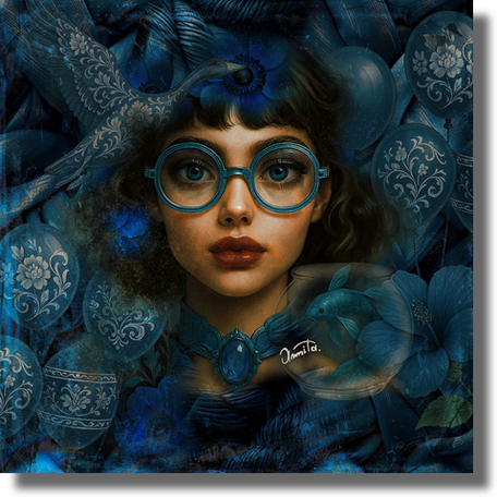
* Kanso *
From the series When Color Knows The Script
Mixed media digital collage
“Kanso is a portrait of inward perception. A surreal meditation on beauty, constraint and the quiet tension of being. The woman stands calmly, observing the world through her glasses yet trapped within her own. A balloon with porcelain patterns floats above her, elegant and fragile, while a goose rests on her head — a symbol of instinct longing to flee. Around her, blue flowers attempt to soften the truth while a crystal bowl holds a solitary fish: her thoughts, suspended in glass. Her necklace tightens like an emotional thread — beautiful but binding. In this moment of contemplative stillness, she is both the dreamer and the observer and blue becomes the color of containment and of clarity.”
GR — Thank you for visiting, Annita Apostolidou Platis. It has been so exciting and interesting to talk with you about your impressive art practice. Congratulations again on winning the EMERALD ARTIST OF THE YEAR 2025 title and know that everyone visiting here today eagerly awaits your next project whatever it may be.
AAP — Thank you for this thoughtful and generous space and for the care you offer in presenting artists and their work. It has been a pleasure to share this dialogue with you. I remain committed to evolving with each step, to deepening both my practice and my perception and to honouring this recognition through the continued development of my work, while staying true to a voice that is honest, personal and distinctly my own. There is always more to learn, more to explore and more to become.